Michael A Morris: Filmmaker
(project in progress)

Timeline
Tools
My Roles
6-8 months
Adobe XD
Adobe Illustrator
Miro
Zoom
Wix
UX Inspection
UX Design
User Research
Usability Testing
Prototyping
Site Buildout
Project Overview
Artists, curators, gallery owners and academic hiring committees need to be able to quickly immerse themselves in the artist's work. They need an easy-to-navigate site on both mobile and web platforms that allows them to view videos without having to leave the site. Any text needs to be brief and easy to read on mobile devices. CV and press should be easy to locate and clickable.
Process
Research:
-
Define the problem
-
User interviews (remote)
-
Empathy map
-
Personas
Design:
-
Epics + User stories
-
Workflows
-
Paper sketches
-
Wireframes
-
Design themes + elements
-
Final buildout
Test:
-
User tasks
-
Remote testing
-
Testing analysis
-
Updates
Research
UX INSPECTION: A curator, a gallery owner and an academic were given the following tasks to do on the existing site:
1. You are curating a mixed media show. You are unfamiliar with Michael's work. Determine what kind of work he does, and whether he would be a good fit for your show.
2. You are on the hiring committee at a university where Michael has applied for a position in the art department. Find his CV, look at his body of work and see if you can find all relevant information to inform your decision.
3. You teach at a university and you're interested in bringing a guest lecturer in to speak to your students. Determine what kind of work Michael does and how to contact him.
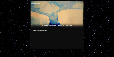
Original Site Images


Empathy Map From UX Inspection
I'm having to do a lot of scrolling
I would be more engaged with the bio if it was somewhere else or just a tiny blerb on the side
If I'm looking for the artist it's a little too much information
Is this news section up to date or is it old? Hard to tell
I want to get lost in someone's visual world when I visit their site
The CV formatting is messy and difficult to read
Not a lot of people use black as a background
I'm going to your site to look at your art, not read text
I don't want to be redirected every time I click on something. I would rather stay on the site
SAYS
I don't mind going to Vimeo, but I wish I didn't have to
I wonder if it would be better to categorize the works by year
There's a lot of unused space on here
I wish the Vimeo links were cleaner
I want there to be more visual works on the home page
I like the moving image on the home page
I wish there was a mobile version
There should be a separate CV for teaching and art
I wish there was an explanation of what expanded cinema is
THINKS
DOES
Looks over the home page then clicks on menu at top
Clicks on
"contact" page
Looks at "film" then "expanded cinema" then "cv"
Clicks on
CV and reads through most of it
Watches videos but not all the way
Scrolls through images, wondering which go with which work
Frustrated that something is just a still when it looks like a video link
I feel frustrated with most of this website
Embarrassed that he's still using a yahoo email
Frustrated that I had to search for Mike's work on the OFG site. That should be a direct link.
Unconnected to his work because the website doesn't immerse me in the experience of his work
Confused by the tiny text and images that are too close together
FEELS
Clicks on
CV and skims
Clicks on
"film and video" to see work
Clicks on
friends and some of those links
I'm irritated every time I get redirected when I click on something
I'm frustrated by the tiny type
I'm disappointed that I don't fully get a sense of the work based on the images shown here
Curator
Academic
Gallery Owner
User Personas

The Gallery Owner:
The Curator
The Academic
-
Wants a quick sense of work
-
Not interested in CV
-
Wants to see press links but probably won’t visit
-
2-5 min spent on site
-
Wants a fuller understanding of work to get a sense of voice
-
Interested in CV, but not teaching CV
-
Wants to see parts of several videos
-
10 min spent on site
-
Wants to take a deeper look at specific works
-
Needs to view teaching and artist CVs
-
Will watch entire videos
-
15-25 min spent on site
LOW
Level of detail desired
HIGH
Using Pain Points to Create Epics + User Stories
As a gallery owner, I want to be able to get a quick sense of the artist's work so that I can know whether I'm interested enough to reach out and make a meaningful connection
As a curator, I want to be able to gain a deeper sense of the artist's work so that I can know if and how their works would fit into a show with other artists' works
As a gallery owner, I want to know if the artist is making relevant work now so that I can quickly determine whether I want to engage with them further
As a curator, I want to know if the artist is making relevant work now and if it is work that I want to promote or be associated with.
As an academic, I want to get a sense of who the artist is and what kind of work they're doing so that I can determine if they would fit in with the culture and focus of the overall department
As an academic, I want to know whether an artist is making relevant work now and how that work might reflect on the institution and the department
Main Workflow
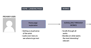


Users will spend 10 minutes on average on the site. In that time, they will visit most pages but not spend much time on any one page. They want to be able to view part of some of the videos, read a little of the descriptions or explanations, see where his art has been shown, who's written about it and how to contact him.
Paper Sketches


Design Inspiration + Elements
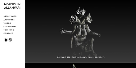
White background with minimalist design to reflect gallery feel. The works take center stage. Text is spare. Visitors will be immersed in the artist's visual world.

Inspiration sites:


MVP: Version 1


(Final site buildout coming 2021)